
Very Peri Is the 2022 Colour
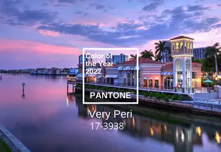
The colours of our lives
Each year Pantone tries interpreting the zeitgeist through colour theory – seeking clues like fashion, design and interiors. It is no stranger to unconventional choices. In 2016 the company chose a gradient of two shades, Rose Quartz and Serenity, reflecting a year defined by shifting gender politics. In 2020 it picked not one but two colours — Ultimate Grey and Illuminating (vivid yellow) — capturing both resilience and optimism seen in the pandemic's first year.
Very Peri PANTONE 17-3938
Displaying carefree confidence and bold curiosity enlivening our creative spirit, inquisitive and intriguing – that is PANTONE 17-3938 Very Peri. Evoking gratitude for some qualities blue represents, complemented by a new perspective resonating today, PANTONE 17-3938 Very Peri puts the future in a new light. As we emerge from intense isolation, our notions and standards shift, and our physical and digital lives merged in new ways. Very Peri has blues' qualities, yet with a violet-red undertone, PANTONE 17-3938 shows a lively, joyful attitude and dynamic presence encouraging bold creativity and creative expression.
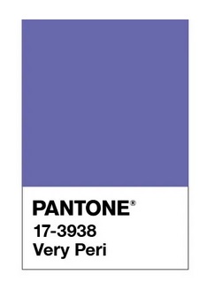
"We live in transformative times" – reads a statement on the Pantone website. "Very Peri symbolises the global zeitgeist and transition we undergo. Very Peri helps us grasp this changed landscape of possibilities, opening us to a new vision as we build our lives."
The Fashion World
Celebrities, street-style stars and other influential figures lean toward this colour during red-carpet appearances and personal events all year. On runways, among others Chanel Metiers D'art and the Lanvin spring summer 2022 Show also stirred many deep emotions.
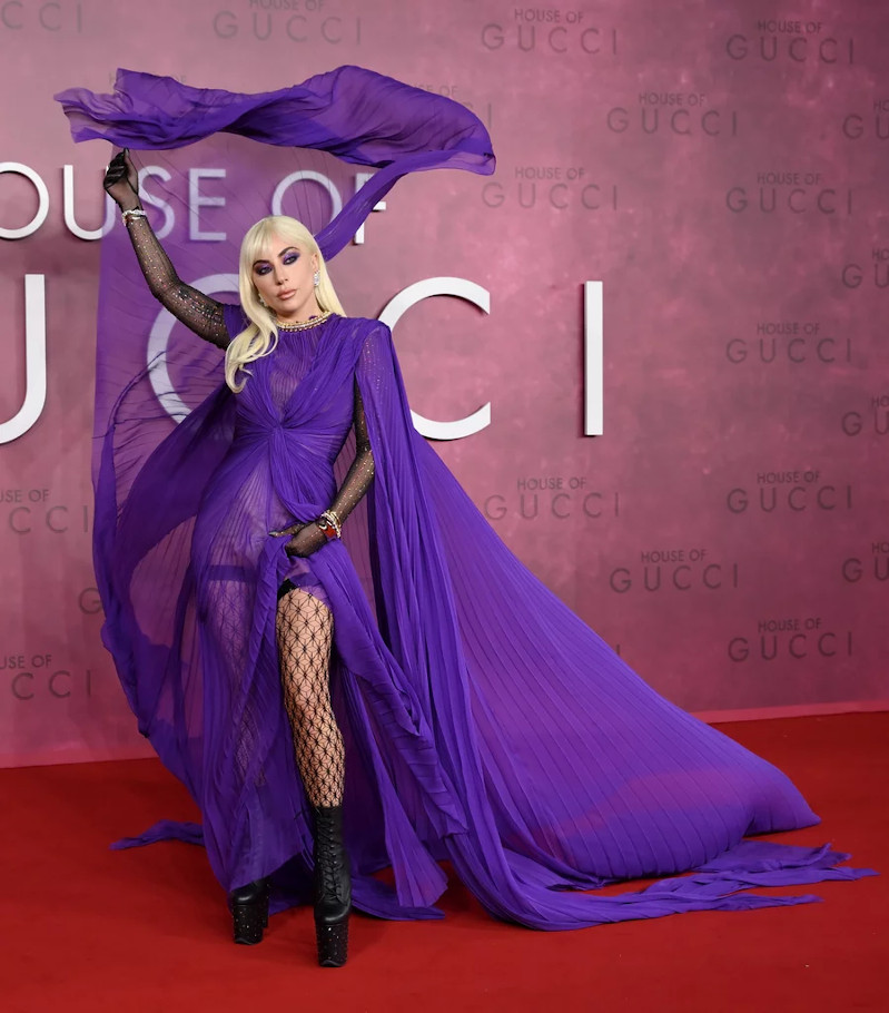
Watch red-carpet stars play with the newest colour and find inspiration to include Very Peri in everyday outfits.